koru

Exceptional UX Design for
enterprise applications

The identity is inspired by the koru fern that represents growth in multiple layers. The word mark also follows the characteristics of the fern. Ampersand developed a list of collateral, website design etc. and provided the client with a detailed brand guideline.

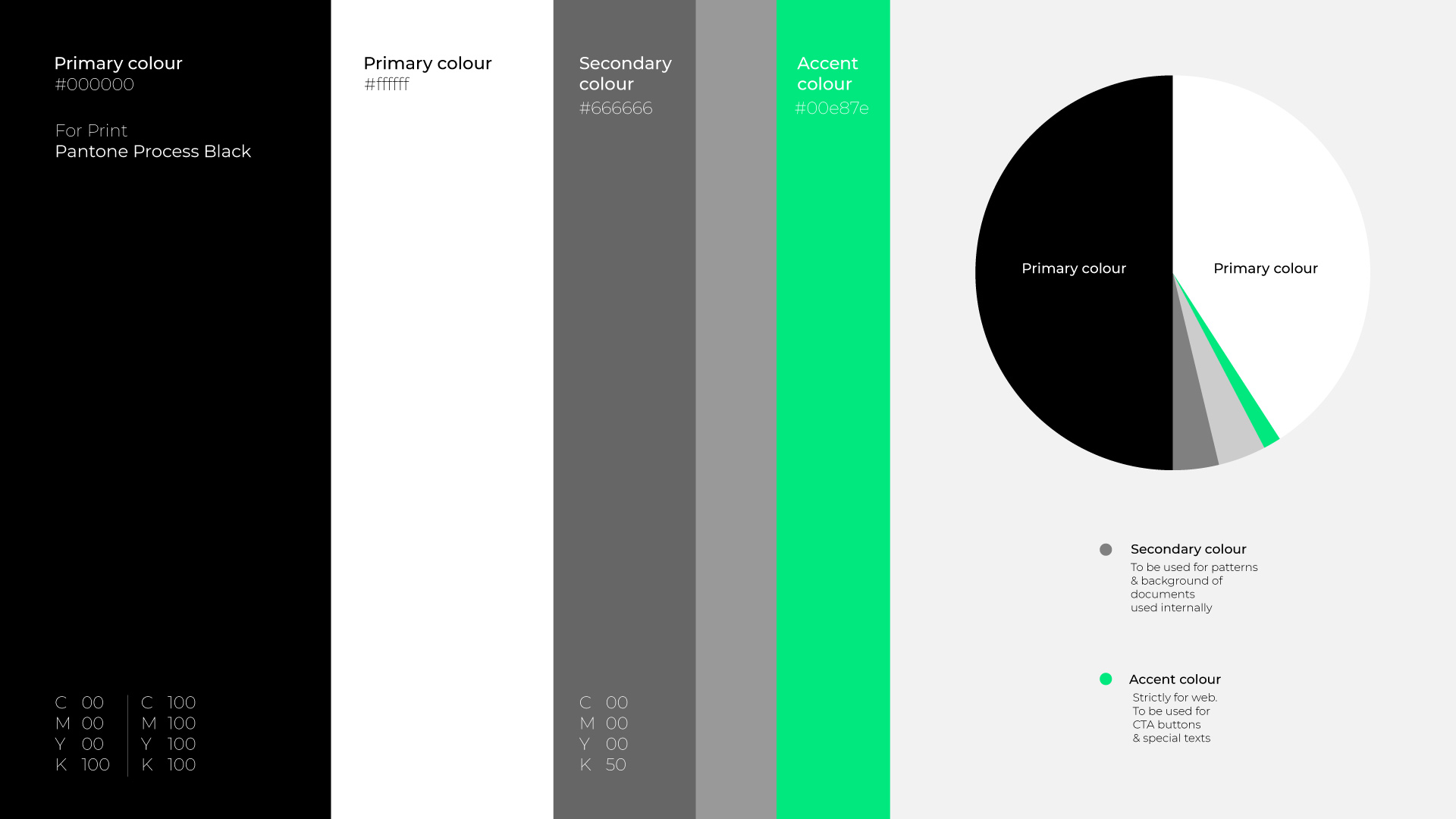
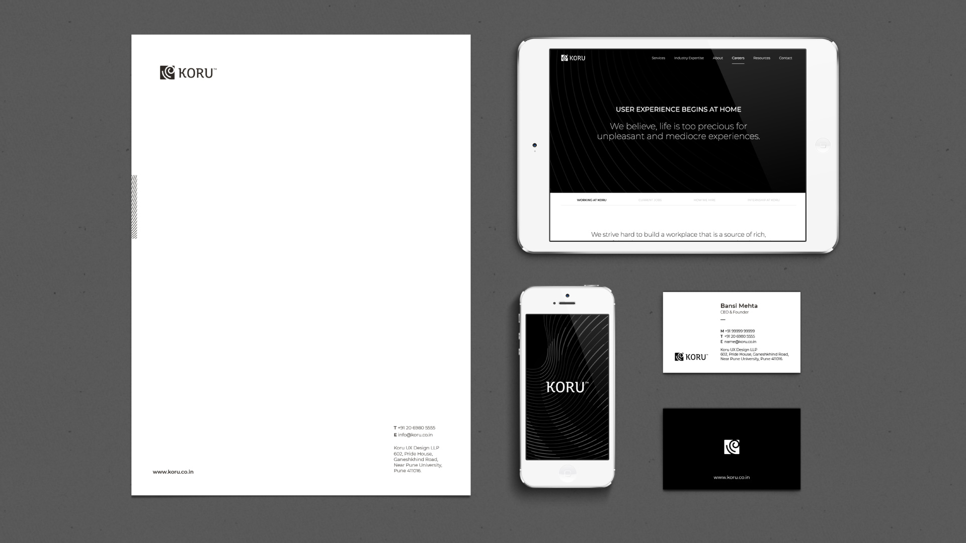
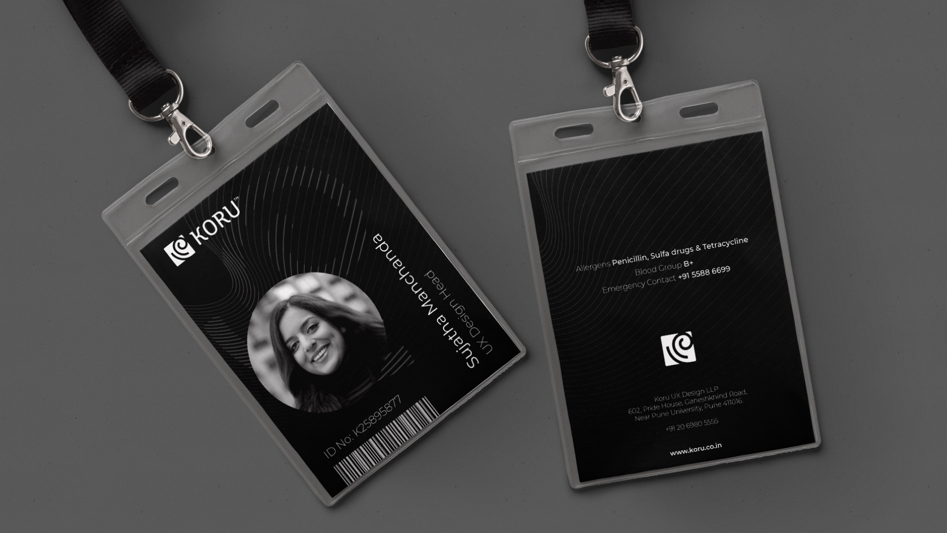
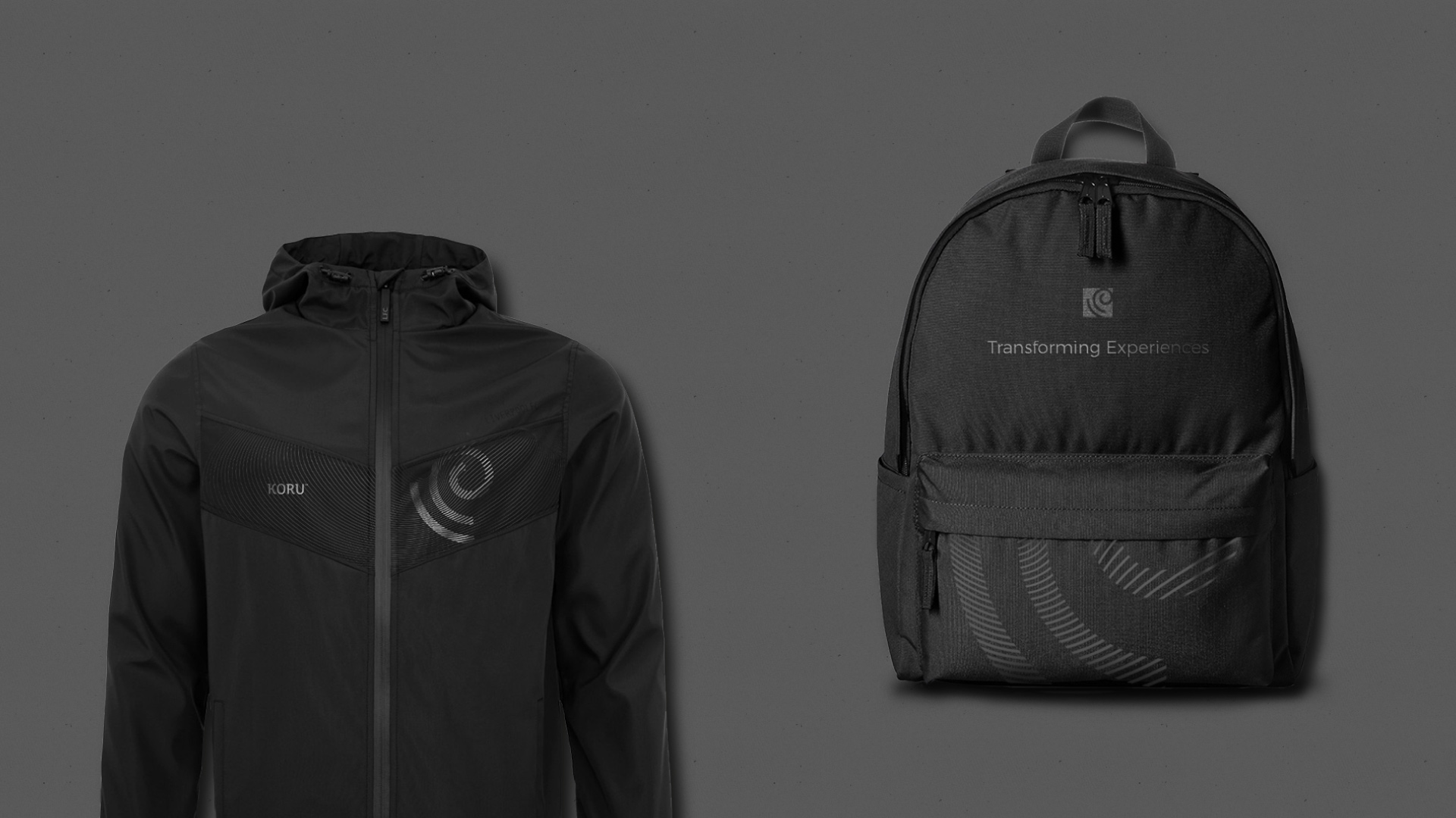
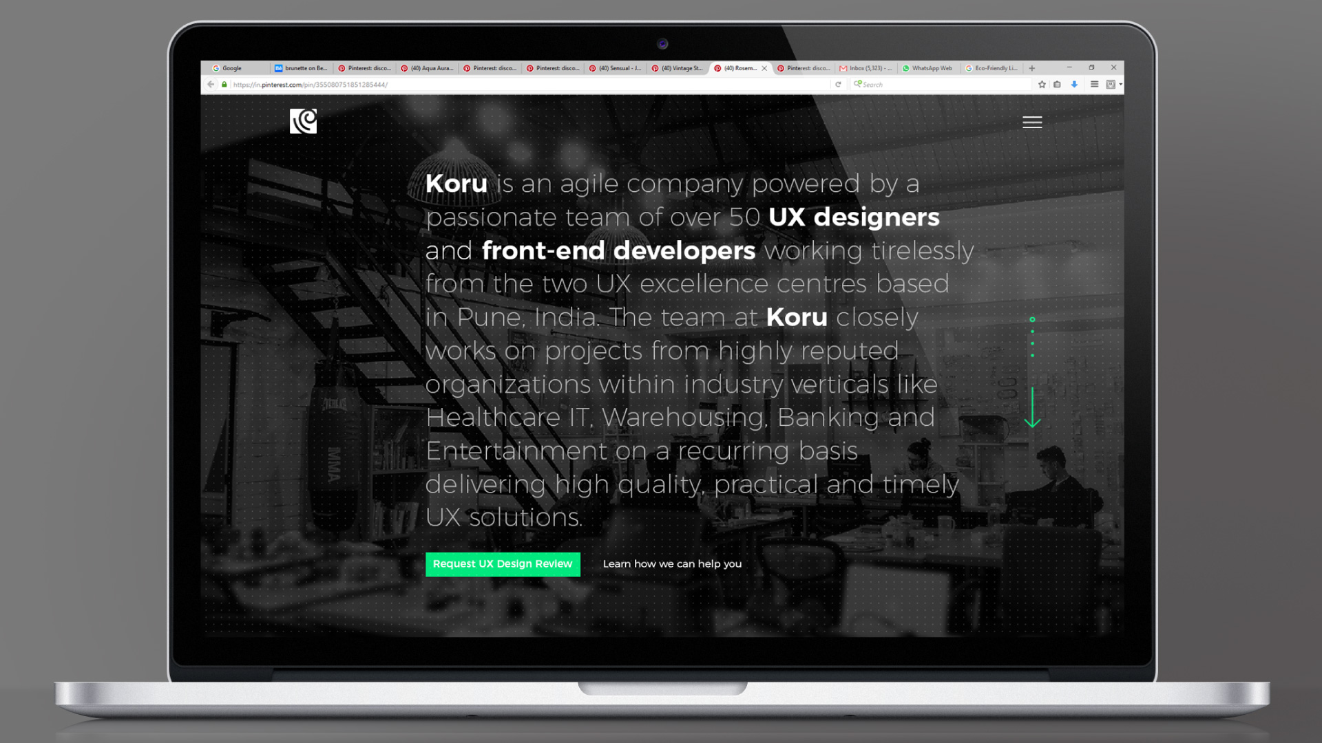
Ampersand helped KORU in re-aligning their brand identity and communication with their aspired brand positioning. Our approach was to design an identity that reflects change. At KORU, inflexible UX gets transformed into a Consumer grade new generation design. The identity also reflects the internal culture at KORU which is young, dynamic and evolving.

Similar Projects

Ampersand_Website_R3_New-Type-system_Logo-Transparent-65px

info@ampersanddesign.in
facbook | instagram

Cookie Recipe
Copyright © Ampersand 2018