Trofii

Pune’s Food &
Nightlife Magazine

The typeface designed for this identity is a classic one. It is a modern take on stylised stencil used with its classic foundation type. The idea of using stencil typeface has also been carried forward in a more tactile manner. The symbol as well follows the same implementation of a classic idea with a modern take on it. This is an emblem that communicates authority, at the same time the approach and execution of the emblem is very contemporary.

The most dominant element of the emblem is a one-eyed night owl with an old lens. The owl resonates the magazine’s role in similar ways, as it is a wise bird, an observer. The one eyed lens of the owl is a classic reference of the old times and the technology of that era.

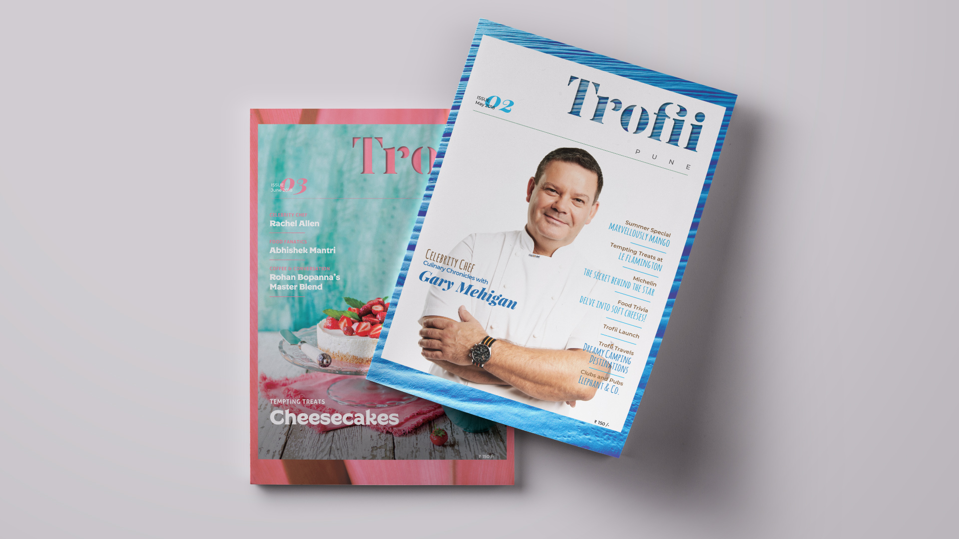
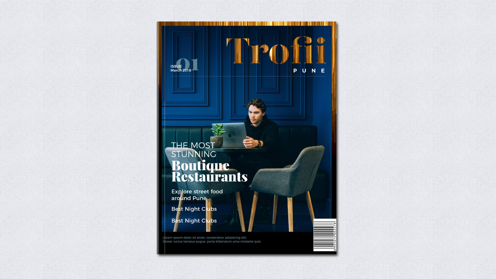
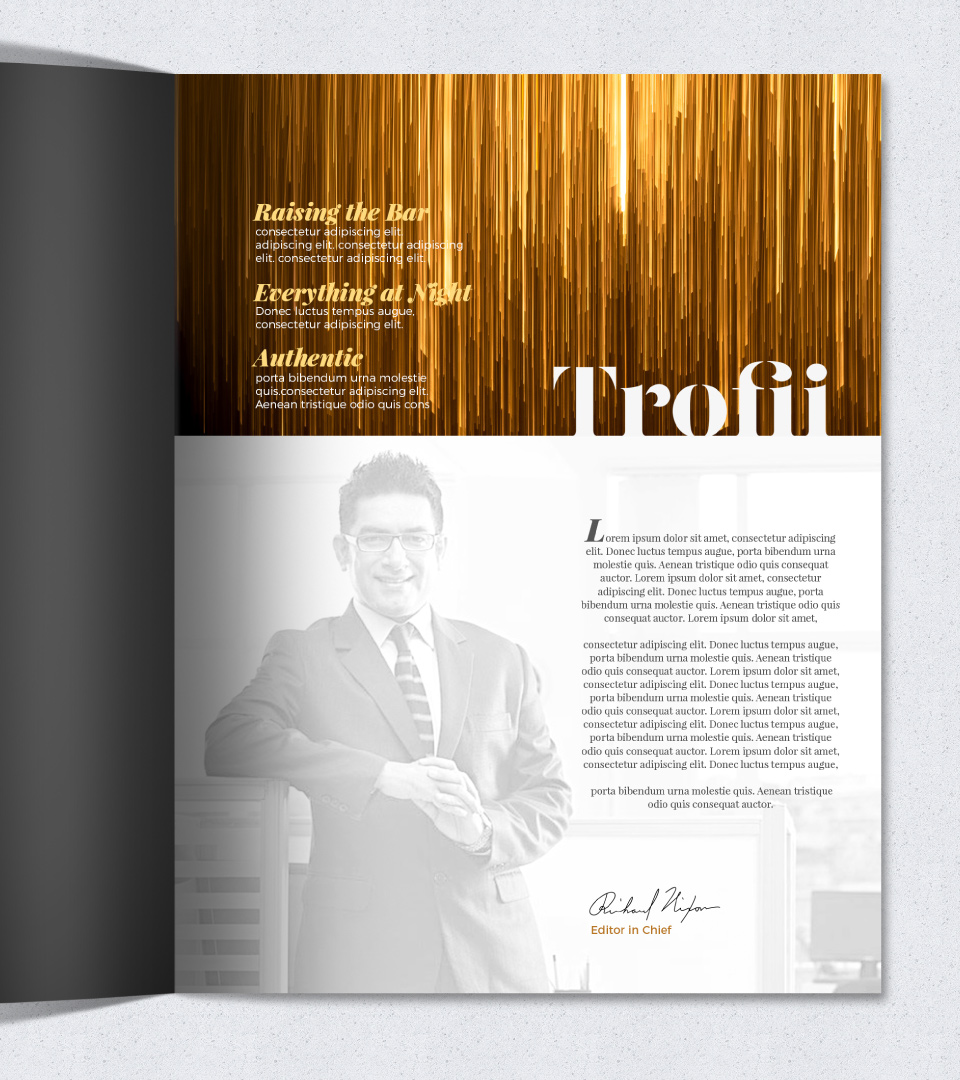
Trofii will be a sophisticated, elite looking magazine; thorough with information, happening with trends and elegant, but fun in style.

Look & Feel: Classic but modern, sophisticated

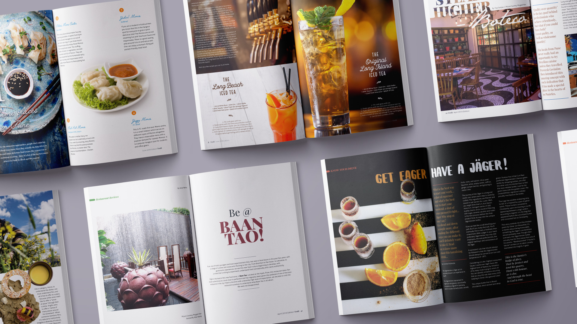
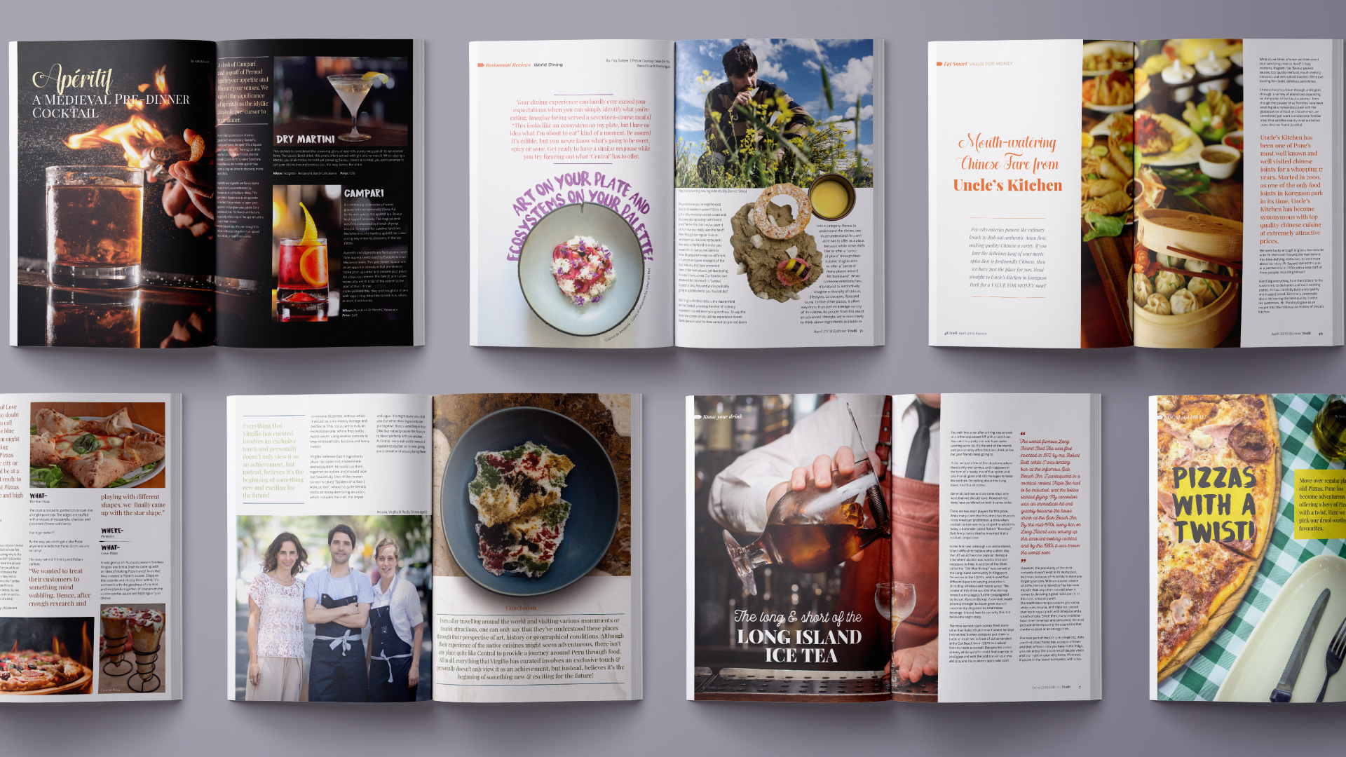
Each magazine is a compilation of around 100 pages offerings articles on Local Food, Upcoming Restaurants, Street Food Joints, Home Chefs with special sections on World Dinning, Celebrity Chefs, Food Trivia, and Know Your Drink.

Similar Projects

Ampersand_Website_R3_New-Type-system_Logo-Transparent-65px

info@ampersanddesign.in
facbook | instagram

Cookie Recipe Copyright ©
Ampersand 2018