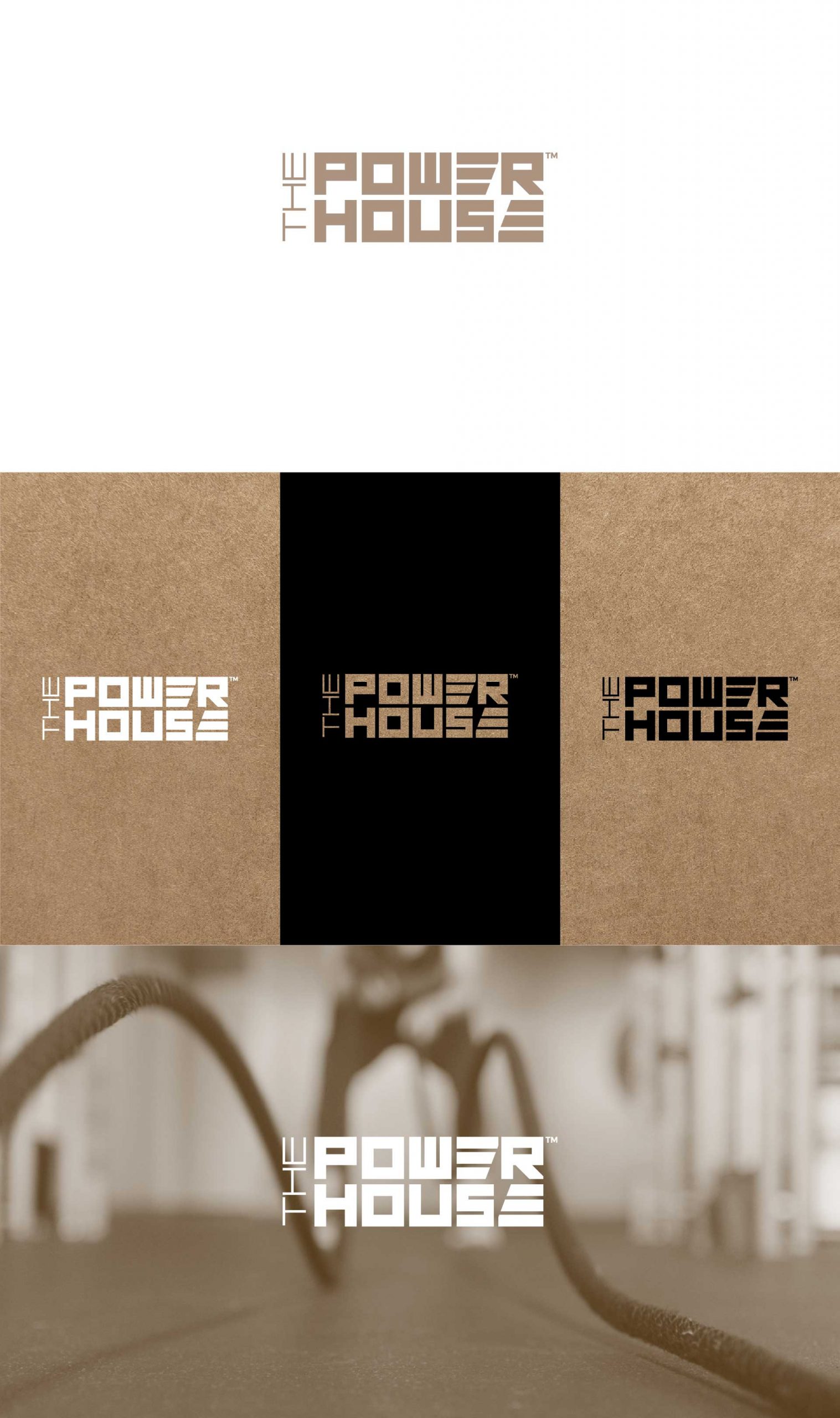
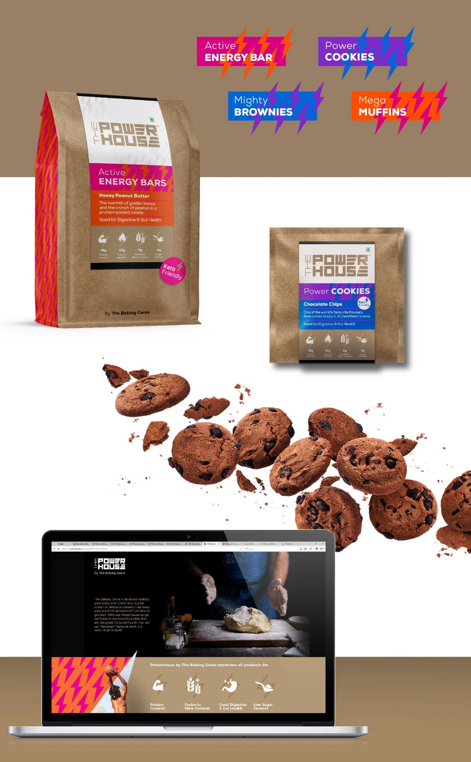
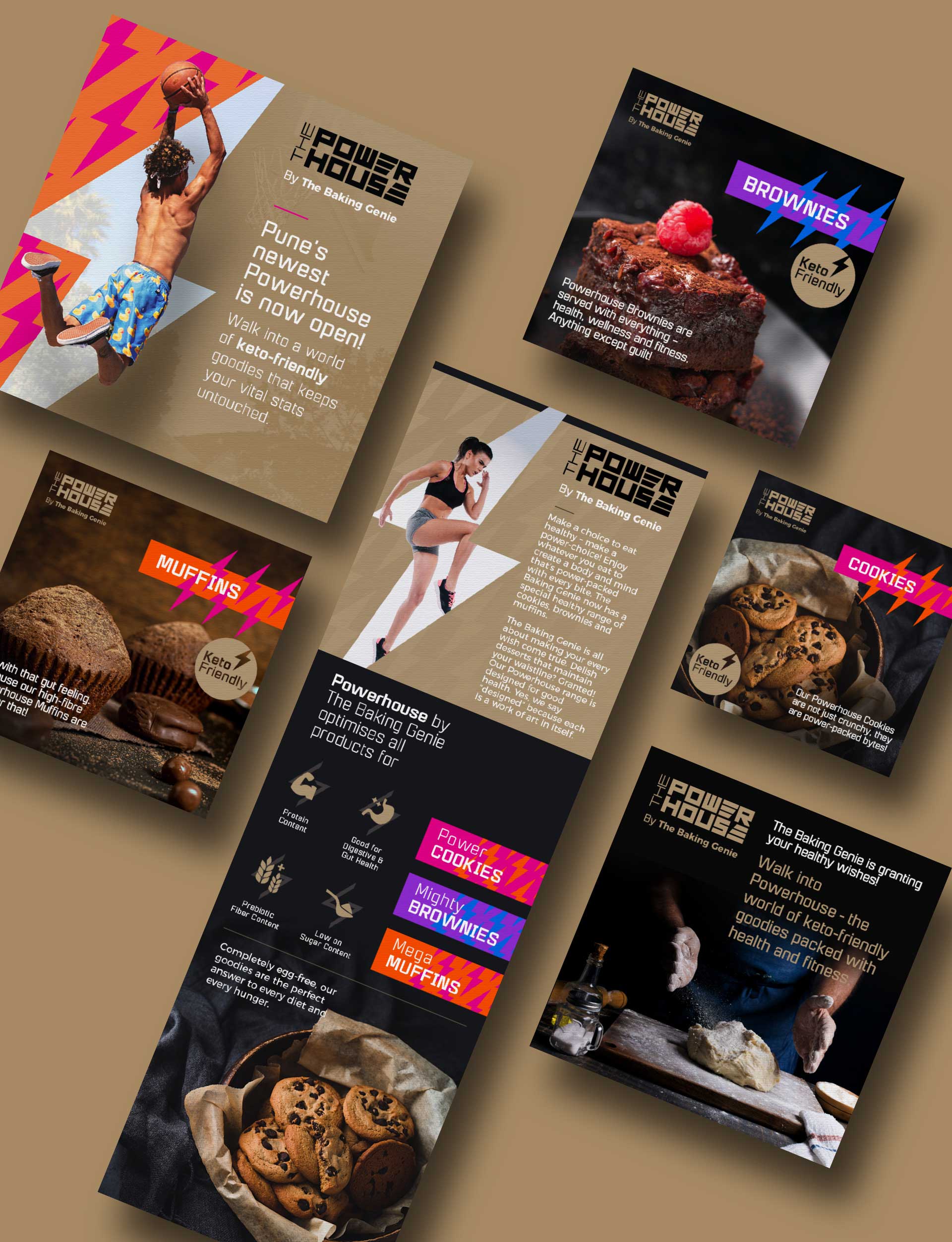
A strong geometric wordmark has been used with a hidden lightning symbol in the counter space which represents power, to make the brand more contemporary
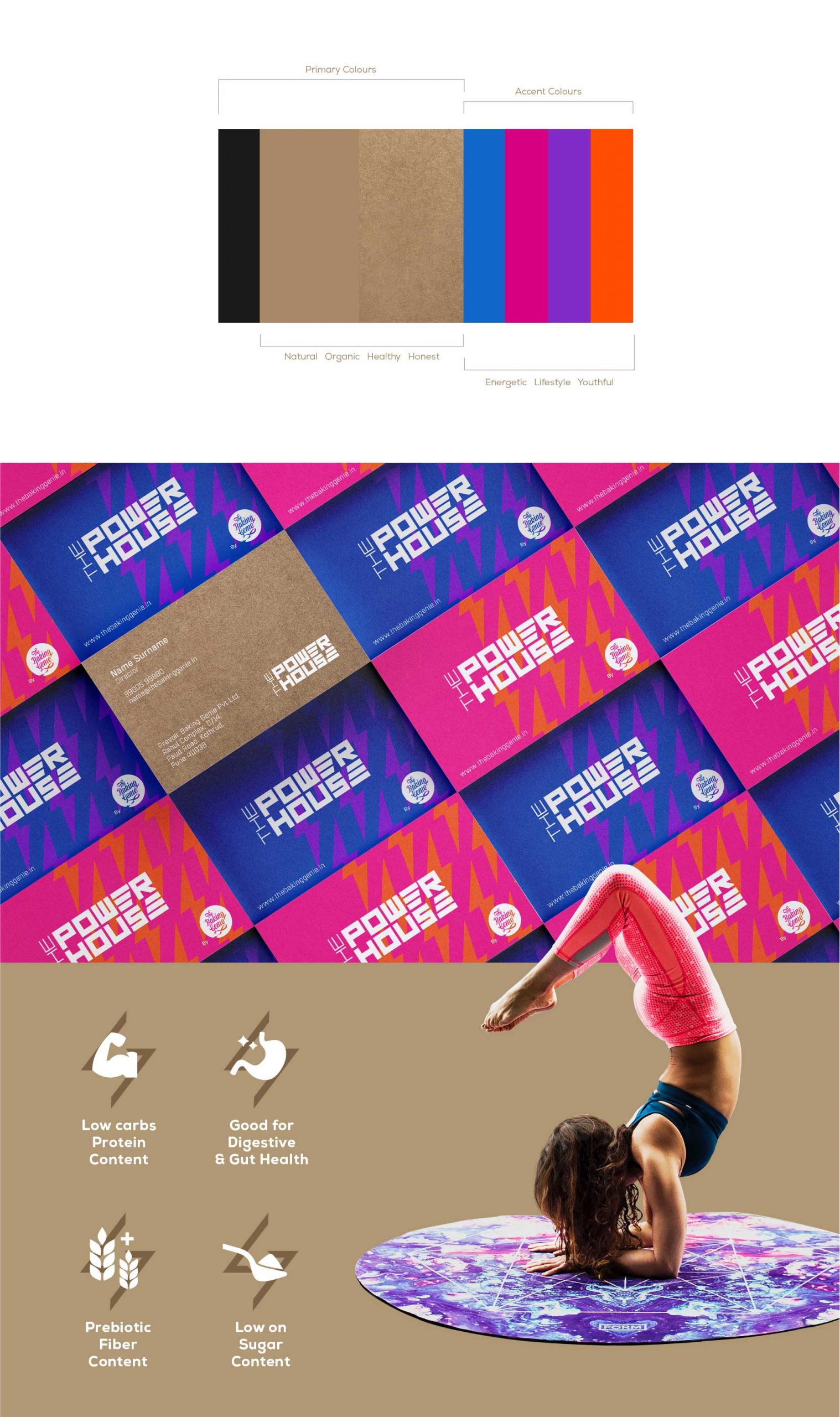
The choice to use natural brown is a conscious effort in projecting the range as a healthy snack without any artificial ingredients along with some prominent touches of vibrant accent colours to bring the happy youthful and fun vibe.